NailDetails by Lindo 💅🏼
Responsive Web Design

HTML | CSS | JavaScript
Mar 2022
A hand-coded website to help showcase a small business personal project of mine, designed mobile-first.
Role
- Web Designer
- Front‐End Web Developer
Tools
- Sublime Text
- JQuery Plugins
- Accordion, MixitUp, Masonry
Problem 😣
Structuring a page layout to promote and summarize my company's nail services that is still intuitive and usable provided as a challenge with so much content.
Solution 🤩
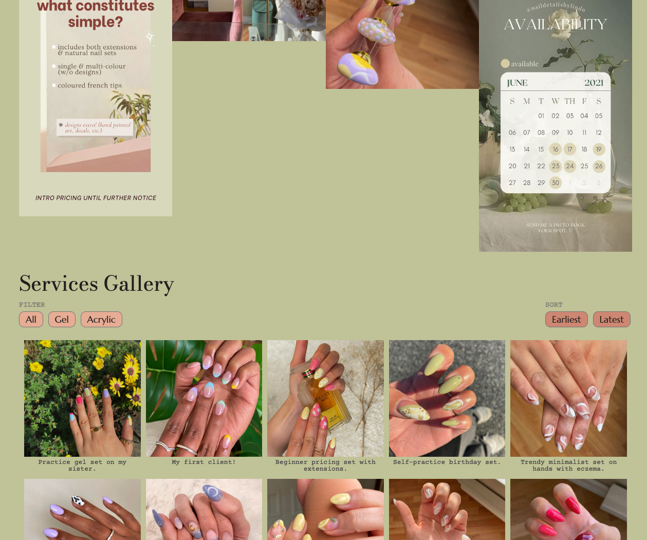
A website that uses several user interface components to optimize the experience in digesting the content, such as accordions, filtering, and sorting.
Final
Site Design
Goal
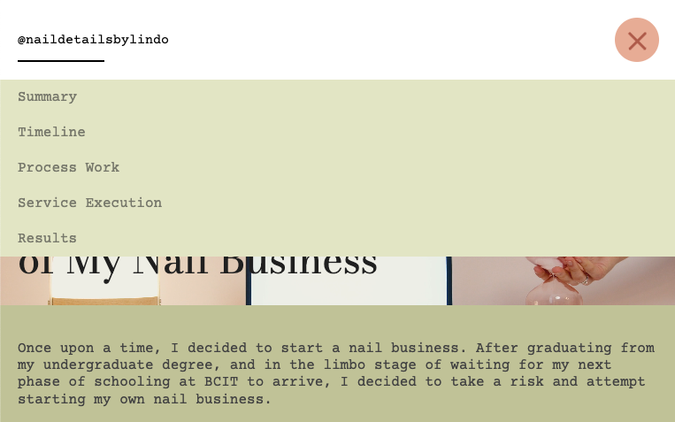
This project was built with a primary goal of building a mobile‐first, responsive website following development best practices and using any three options from a select few JQuery plugins. Intended to be responsive in every aspect, the website thus changes dynamically at several breakpoints, with a focal point on differently‐behaving navigation menus for mobile versus desktop viewports.
This project attempts to showcase good, responsive web design and the positive effects of doing so on final web products, particularly in the form of a functional and user‐friendly webpage for all device sizes.
Research & Planning
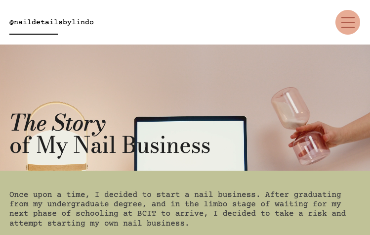
For this responsive web project, I chose to create a site page to showcase my nail business that was taken on as a personal project during the Covid‐19 pandemic. For a website showcasing a portfolio project such as this, I designed it to be responsive and mobile‐first to maintain usability for the range of potential users who may be viewing across different devices.
First, the brainstorming step involved envisioning a site design that would align with and extend the existing brand identity, which I designed and established during the launch of the business.
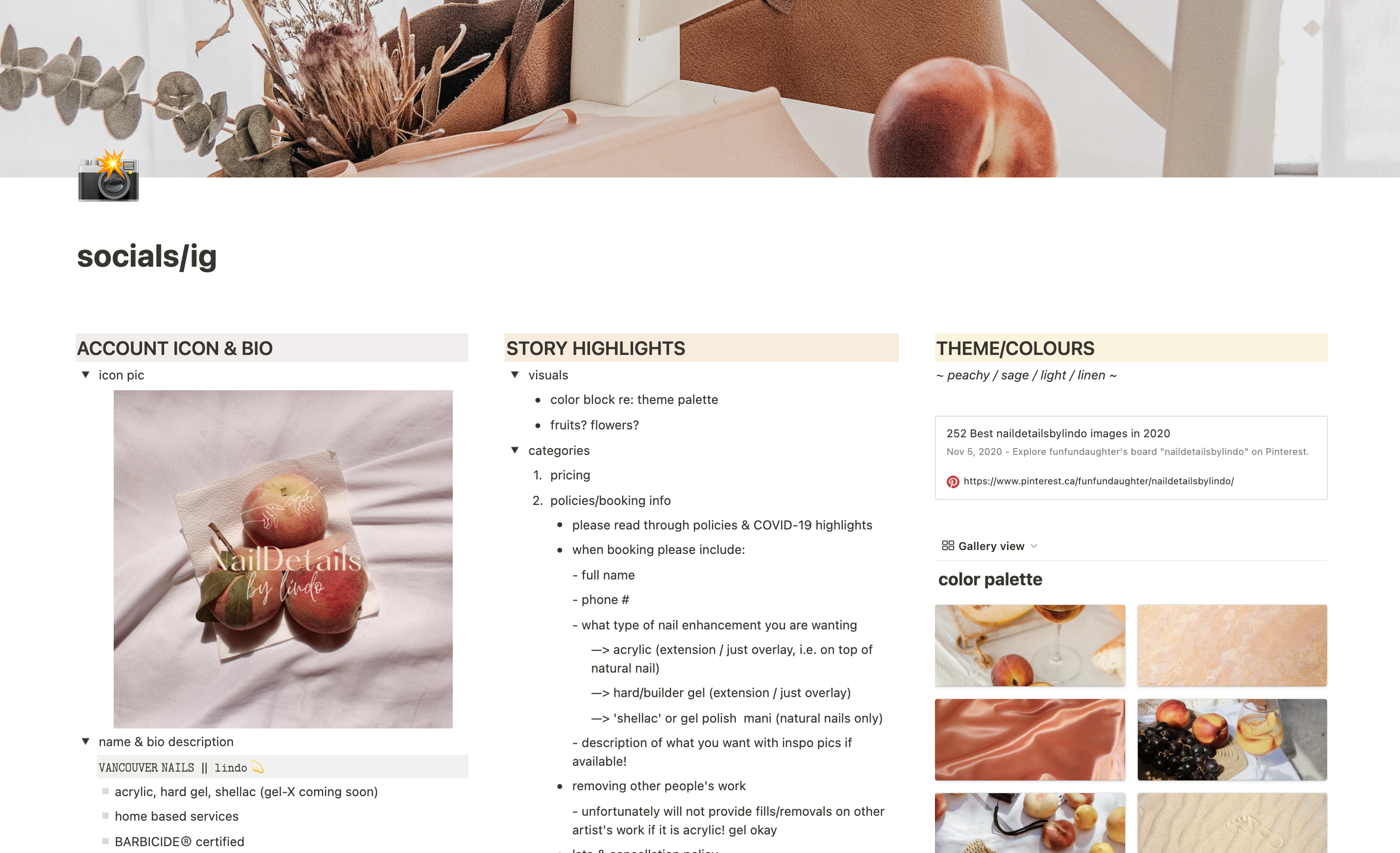
A style guide for the design was easily created, then, by following the brand's primary colours as well as choosing web‐safe Google Fonts to reflect the brand's elegant and nature‐like personality. After roughly planning and segmenting out the webpage's content to include a project timeline section, image gallery section, and another section for filtering between nail services, jQuery plugins (Accordion, Masonry, mixitup) were also researched and chosen based on their functionality, plugin‐ flexibility and ability to be responsive.
Site Design & Content Prep
When it came to the website design and sketching out the lo‐fi wireframes, 6 different versions were created in order to account for all of the major device breakpoints — ranging from mobile devices (280px) first, and then progressively larger to desktop (1440px). This was done with section spacing, layouts, and navigation changes for each breakpoint to ensure that the site's design was appropriate and optimally effective for viewing on each device size.
For example, device viewports under 768px were designed with a burger menu to view navigation in order to account for the decreased viewport width. From a mix of both personal and curated sources, images were then gathered and optimized from a previous collection curated for the business, and then followed by copywriting to populate site content relative to their sections.
Development
Using a systematic approach to optimize my coding workflow, I brought my design ideas to life by organizing and setting up my HTML file according to the page sections mentioned above — and primarily starting from the mobile viewport size breakpoint — to ensure that I build out my site according to the mobile‐first design.
In following the created wireframes and building out components such as the sections, using descriptive naming conventions for those beyond required plugin classes, coding with proper semantic markup, and having design deliverables readily available and optimized, development and styling was made smoother when it came to implementing both the plugins and designs for each progressive device media query.
My design process and organized, D.R.Y. development approach not only resulted in a final website that is dynamic and accessible for users across all devices, but which would also be clean and logically easy to follow for any future developers hoping to inspect my code.
View Live Site*personal notes & insights can be found here!
*this was my first real attempt at visual branding!