CaféHop Mobile App ☕️
UX UI App Design

User Flow | Hi-Fi Prototype | Usability Testing
May 2022
Illustrating the full UX UI design process and interactive prototype for the development of a personal app idea, CaféHop.
Role
- UX Researcher
- UI Designer
Tools
- Draw.io
- Adobe XD
- Useberry
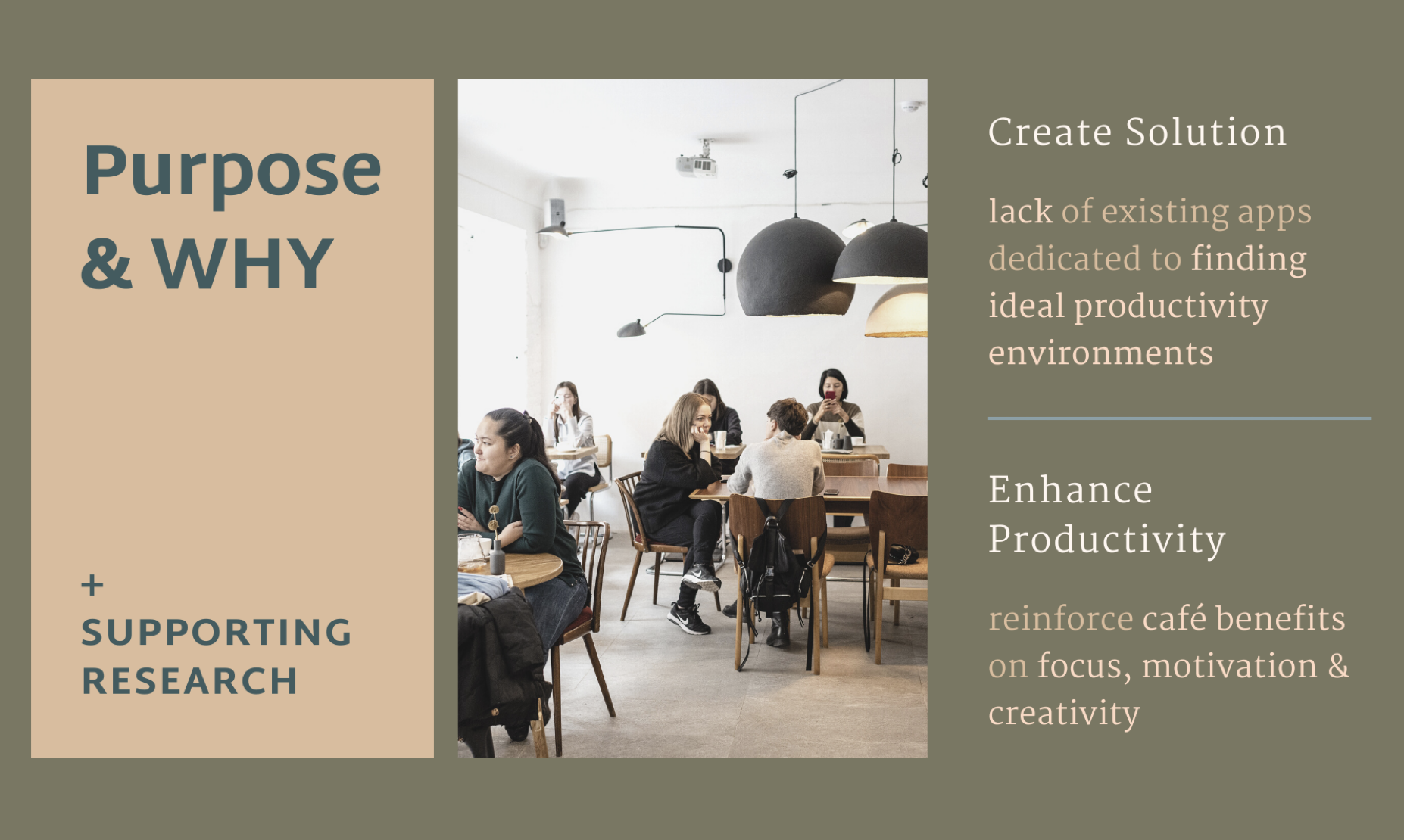
Problem 😣
Students, freelancers, and cafe-goers have difficulty finding new cafes to do work at with their desired traits and features.
Solution 🤩
A mobile app with with online shopping styled filters, for coffee shops!
Final
App Design
Goal
The initial goal was to come up with an app idea, which involved deciding upon an original app name and description, creating sample screenshots of the app, and conducting user research re: the app’s target audience and purpose. This was further built upon by creating an interactive and realistic prototype for a fictitious business’ website or mobile app using Adobe XD, and to later implement revisions based on user-testing data.
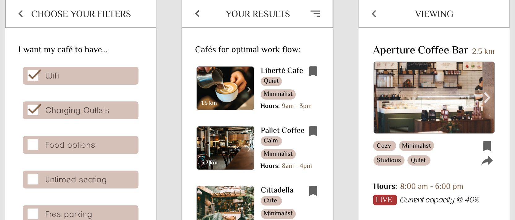
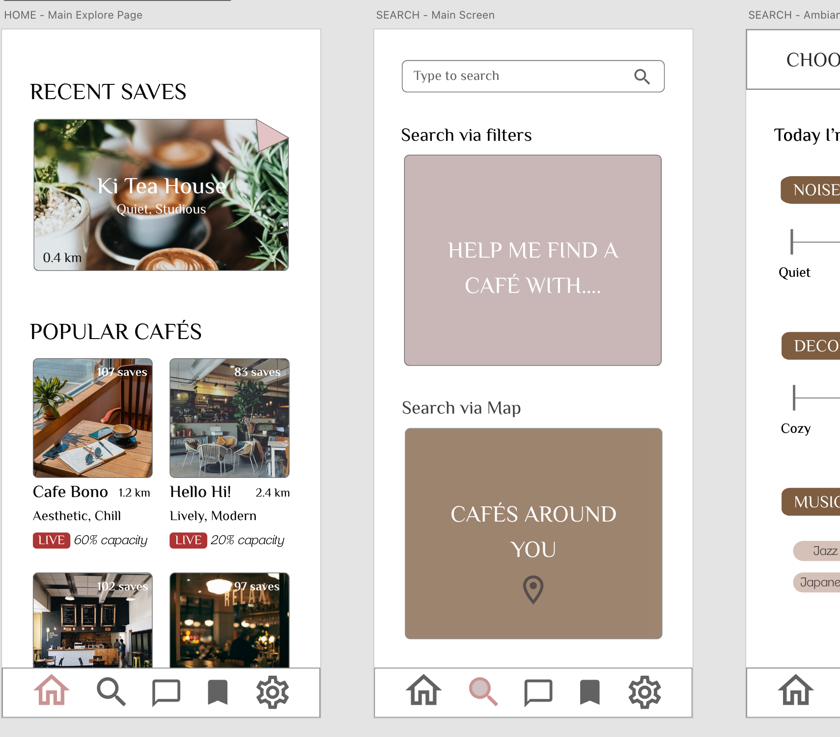
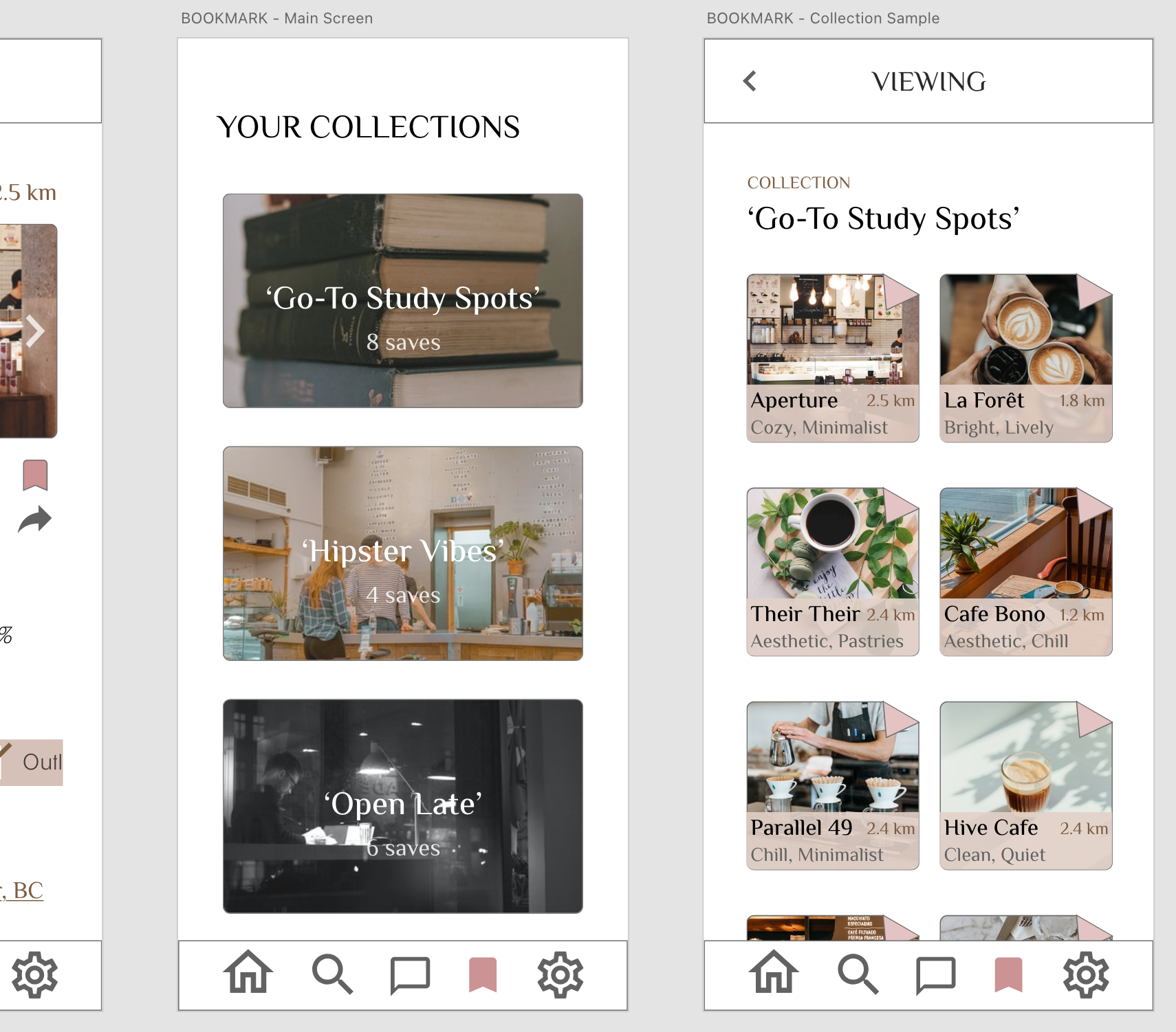
The website or app also needed to include a key process or functionality (such as browsing, bookmarking, checkout, or user settings, etc.).
Ideation & Market Research
Preliminary research was done when it came to ensuring uniqueness for the app concept and name. High-level value proposition mapping was also done in planning how the app would look and function, who the target user groups would look like, and the main purpose that users would use the app.
It was ultimately decided in this phase that the app’s main selling point would be a searching/browsing function with a set choice of filters, allowing users to find coffee shops with different conditions and traits.
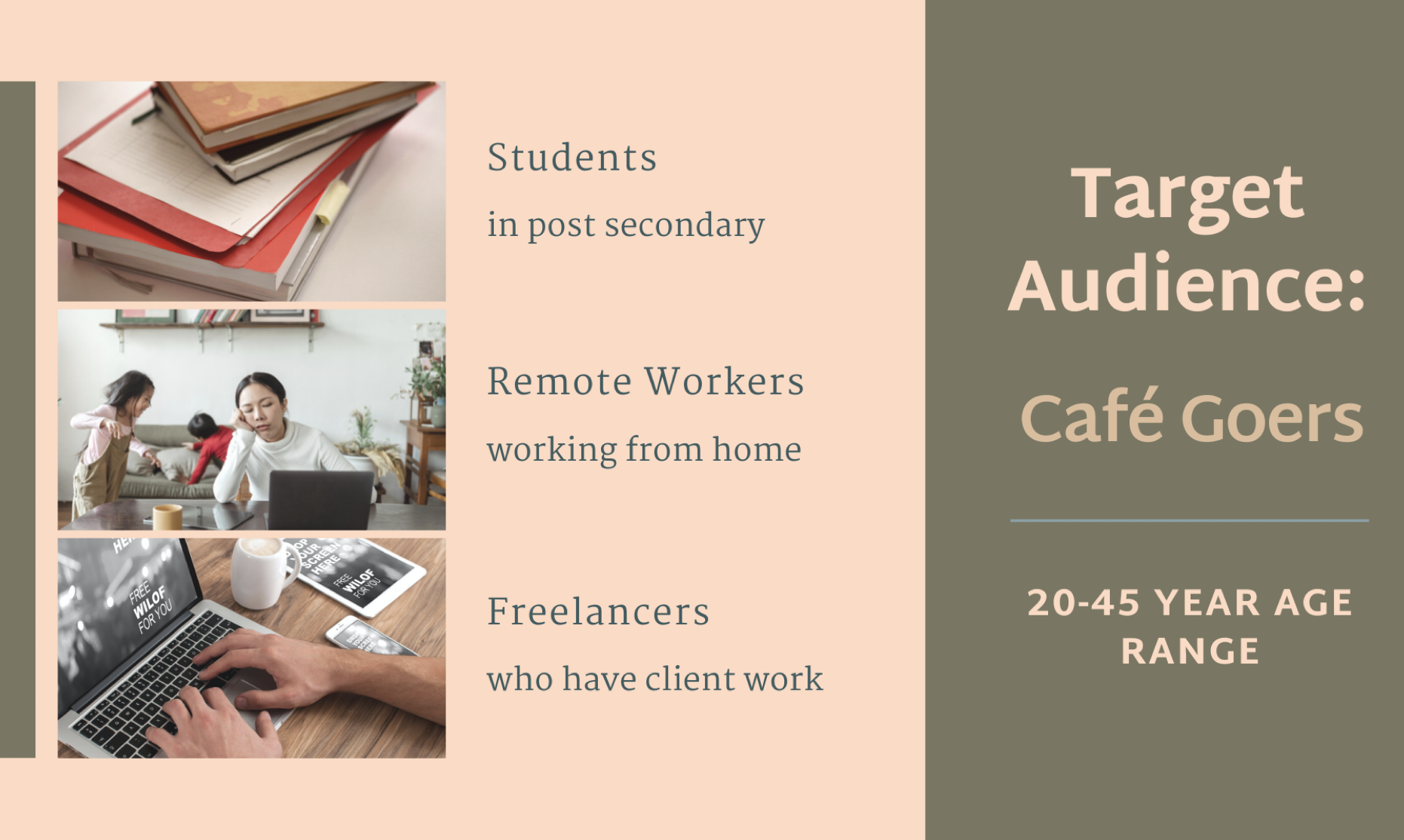
User personas were created with their respective pain points (students, remote workers, and freelancers), and the initial app idea was validated as providing a solution for these pain points.
Market research was also done during the search for similar apps. Here, it was found that related applications that did exist mostly tapped into other branches of coffee- or productivity-related interests and concerns. Most apps found on the app store were either for specific café brands, apps to help coffee-drinkers make their coffee beverages, or ordering & delivery-based apps.
On the productivity side, existing apps were primarily functional in helping execute productive modes, though none were related to coffee shops. This phase of the app design process, then, helped reveal the app’s potential indirect competitors rather than direct ones.
App Planning & Design
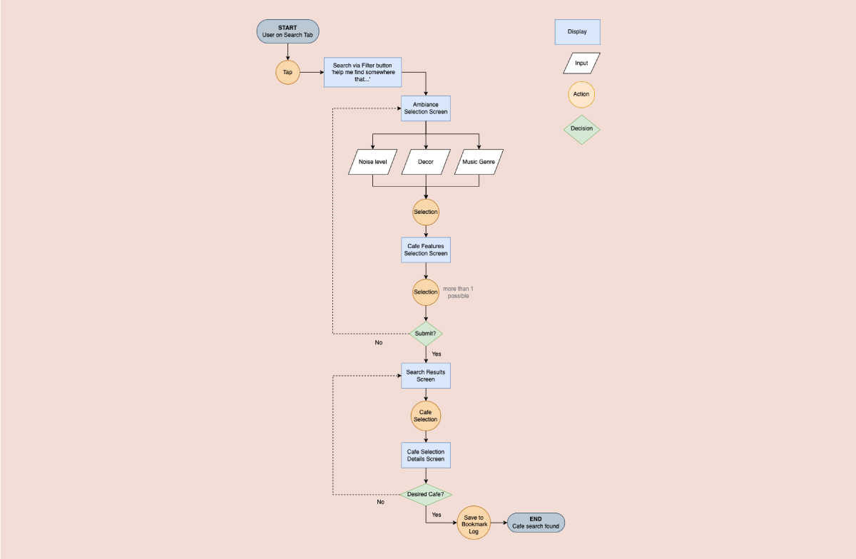
In thinking through the app’s functions and processes that would help with allowing users meet their end goal(s), a user flow was outlined to help visualize the step-by-step actions that could be taken by users while on the app. This was specifically done for the search and bookmarking process, of which would be primary tasks. The visualization of the user flow ultimately helped with discovering the most logical sequence of steps in the app, as well as reflecting on any inefficiencies, missing steps, or confusing issues.
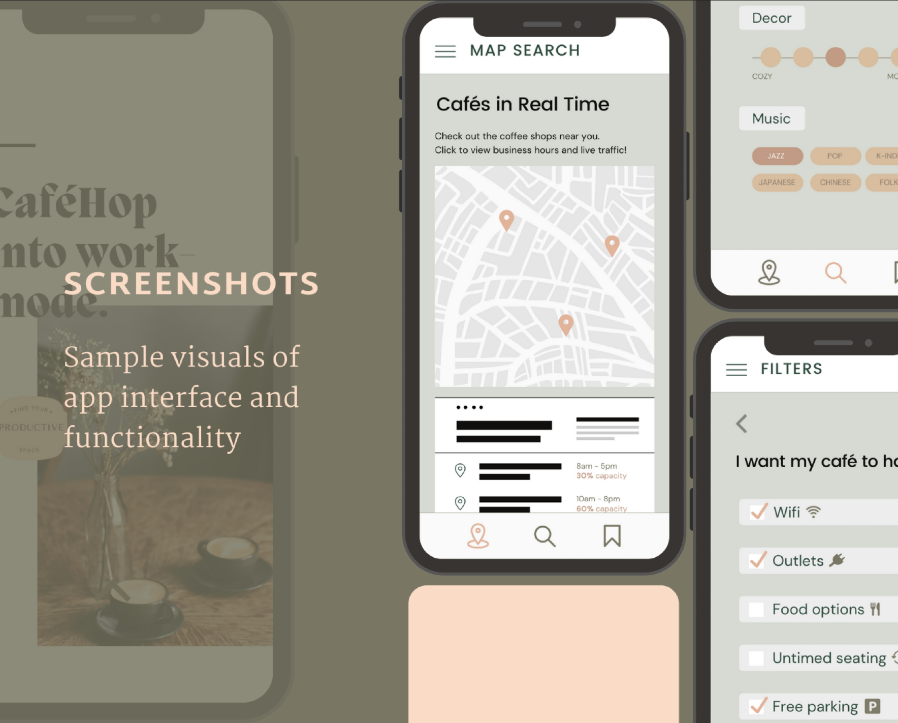
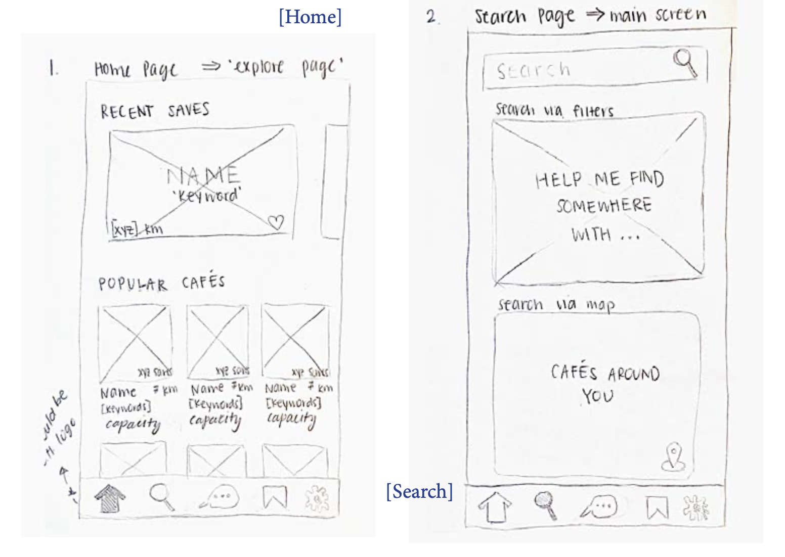
Lo-fi wireframes of the app were sketched out by hand based on what I envisioned the app to look like, and according to the screens and steps that surfaced in the user flow stage. A total of 8 screens were drawn to meet course requirements which demonstrated the key search process aspect of the app, with surface-level in-app copy decided (such as headings and category labels).
Prototype
The user/usability testing phase was conducted through an online platform known as Useberry. Given the remote nature of the testing platform, the test was developed and structured based on the key tasks within the primary functions prototyped on XD. Since the testing was done within a school course context, the testing link was disseminated amongst classmates and peers, for a total testing group of 9 users. Once the testing phase was complete, usability data obtained from several Useberry metrics was analyzed to spot both successful and problematic areas of the app. The platform helped illustrate from the users’ perspectives potentially confusing areas by way of metrics such as mis-click heatmaps, task-completion times, and task-completion rates.
View Prototype*personal notes & insights can be found here!
*for an app that I had imagined since university, seeing it come to life was exciting!